03 / 04
Clients don't think in CRM modules
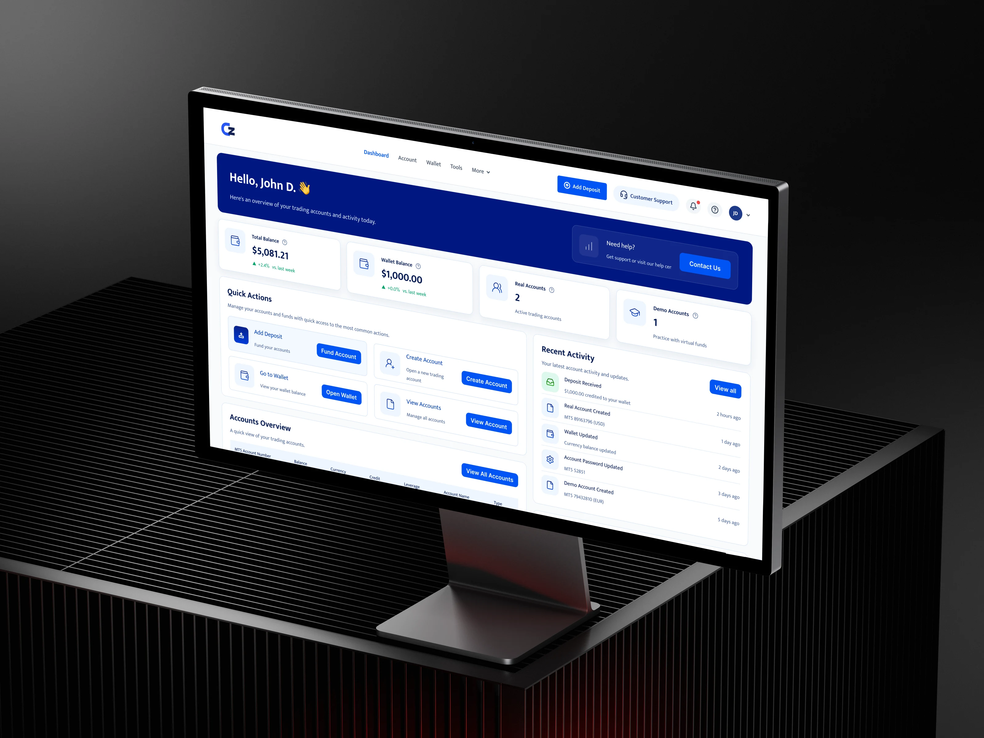
ClientZone is the client-facing portal of the Teamforce CRM platform, where brokerage clients manage trading accounts, deposits and withdrawals.
A client portal should reflect the client's world, not mirror the internal CRM's modules. I redesigned its structure, dashboard and money journeys around that principle.
the problem
The portal was shaped like the CRM behind it.
ClientZone had grown module by module, following the internal system's structure. For a client trying to answer “how much do I have, and what can I do with it?”, that structure got in the way.
The redesign starts from one rule: a client portal should reflect the client's world, not mirror the internal CRM's modules.
system · template
A template, not a one-off.
ClientZone ships as part of the platform, so the design had to be a set of reusable parts rather than a set of pages. Each brokerage applies its own logo and primary colour; structure and patterns stay the same.
pattern · page anatomy
Every wallet page follows the same five parts.
01
Context
Page title, or a breadcrumb back to Wallet.
02
Rule note
A plain-language explanation when money rules apply (free margin, open positions).
03
Account selector
Choose the trading account. Everything below follows that choice.
04
Figures + primary action
Account figures as cards, with the main action top right.
05
History
A table with status chips, filters, pagination and row actions.
components · shared parts
Reusable parts, grouped by job.
Shell
- Header with Add Deposit and Support
- Brand slot
- Notifications, help and profile
Summary
- Stat card
- Quick action card
- Activity row
Data
- Accounts table
- History table
- Status chip
- Filters and pagination
Trust
- Rule note
- 2FA chip
- Required-field marker
Overlay
- Side drawer
- Segmented choice (Demo / Real)
evidence · what I'd measure
How the redesign's success should be judged.
I'm not claiming outcome metrics for this redesign. These are the signals I'd use.
Comprehension
Can a client state their balance and account count from the dashboard alone?
Findability
Time to reach a specific transaction or account detail.
Completion
Deposit and withdrawal requests started vs submitted.
Support load
Tickets about balances, free margin or “where is my deposit?”
Screens are from the redesigned template, shown with test data.
honest read
What I'd refine, and what I'd test
I'm not claiming outcome metrics for this redesign. The problems come from design reviews and proposals, not formal usability testing, and the original screens weren't archived, so the before state is shown as a structural diagram rather than a screenshot.
What I'd refine: distinct figure cards, because balance, equity, credit, margin and free margin deserve their own icons and emphasis, and free margin is the one that matters for withdrawals. One help entry, because the dashboard shows help twice and one persistent entry is enough. Clearer page naming across deposit and withdrawal views.
What I'd test: a five-second test on the dashboard to see what clients remember. Task tests: find a deposit, create a demo account, withdraw from a specific account. And a support ticket review before and after rollout.
Clients don't think in CRM modules. The portal now starts from their questions.
Informative Nudge
Next