03 / 04
Clients don't think in CRM modules
ClientZone is the client-facing portal of the Teamforce CRM platform, where brokerage clients manage trading accounts, deposits and withdrawals.
A client portal should reflect the client's world, not mirror the internal CRM's modules. I redesigned its structure, dashboard and money journeys around that principle.
the problem
The portal was shaped like the CRM behind it.
ClientZone had grown module by module, following the internal system's structure. For a client trying to answer “how much do I have, and what can I do with it?”, that structure got in the way.
The redesign starts from one rule: a client portal should reflect the client's world, not mirror the internal CRM's modules.
the experience
Summarise first, then let clients act and check.
The redesign covers three areas: the dashboard, trading-account management, and the wallet. Each opens with what the client most needs to know, then what they can do next.
Redesigned
- A client-first dashboard
- Real and demo account management
- Connected wallet journeys
I owned
- The “client's world” principle and new structure
- Dashboard hierarchy and quick actions
- The shared wallet page pattern
Team input
- Which account fields must appear (operations)
- 2FA and free-margin rules (compliance)
- Template constraints (engineering)
Evidence
- Problems come from design reviews, not usability testing
- No outcome metrics claimed
- Measurement plan in Build
Dashboard
1
Starts with the client.
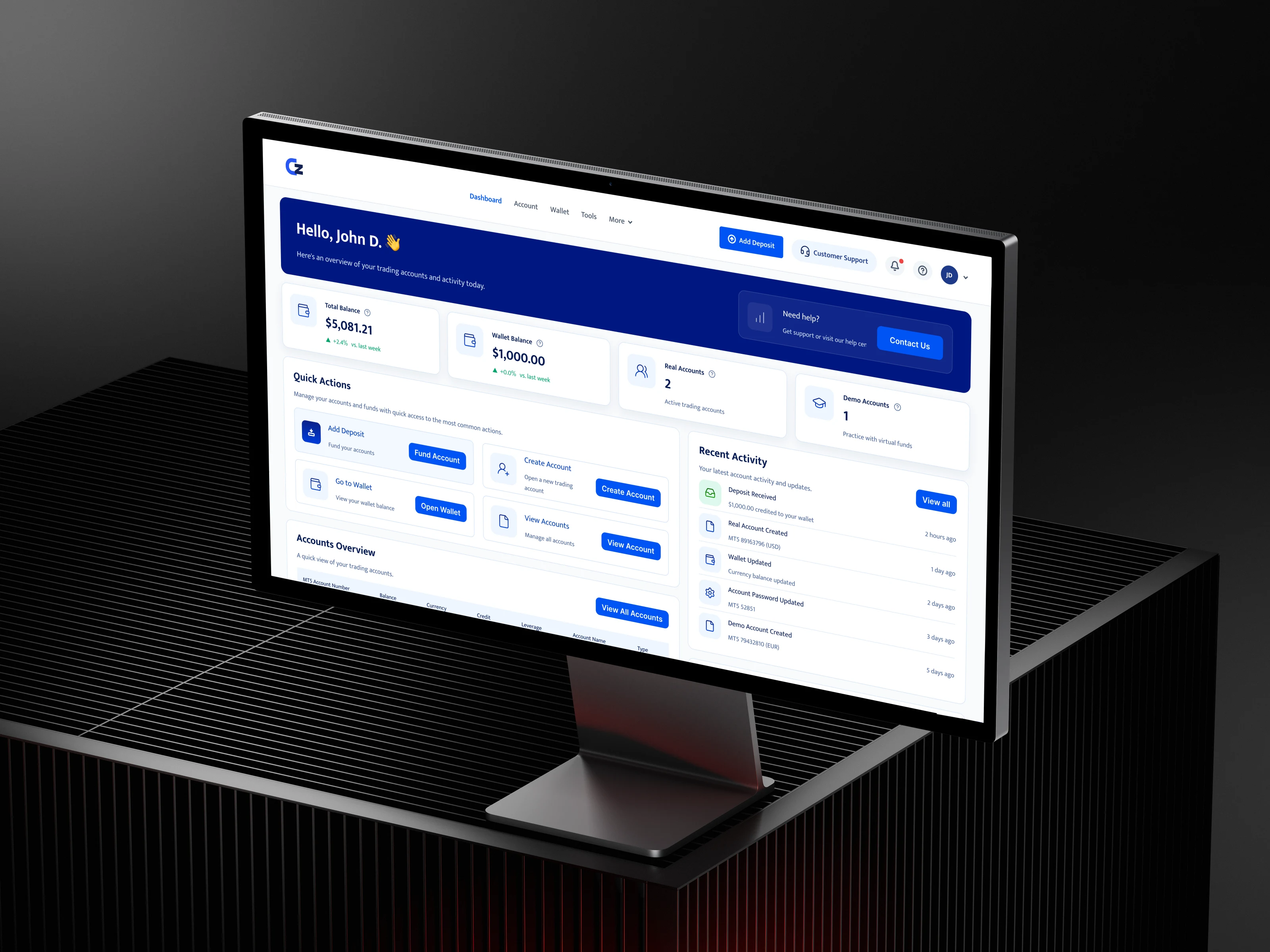
A greeting and “an overview of your trading accounts and activity today”.
Dashboard
2
Their situation in four numbers.
Total balance, wallet balance, real accounts and demo accounts.
Dashboard
3
What they can do next.
Quick actions grouped by intent, not by module.
Dashboard
4
What changed recently.
Deposits, new accounts and password changes, newest first.
dashboard · prioritisation
A homepage that explains the client's situation before offering navigation.
The dashboard reads top to bottom as four questions. Where do I stand? Summary cards show total balance (with change versus last week), wallet balance, and how many real and demo accounts the client holds. What can I do? Quick actions cover funding, creating an account, opening the wallet and viewing accounts. What do I have? An accounts overview lists each MT5 account with balance, currency, credit, leverage and type. What changed? A recent-activity feed shows deposits, new accounts, wallet updates and password changes.
Help is always within reach, in the header and on the dashboard. Money questions are often urgent, so support shouldn't be hidden behind a menu.
trading accounts · clear choices
Creating an account without leaving the page.
New accounts open in a side drawer over the accounts page, so clients keep their context. The first choice is the one that matters most: Demo or Real, as two large options rather than a dropdown. The form then asks only what's needed for that type: a demo group or a real group, marked required.
The accounts structure had to hold account numbers, balances, leverage, groups, names and management actions without turning into a wall of fields. The overview shows the essentials, and details live one click deeper.
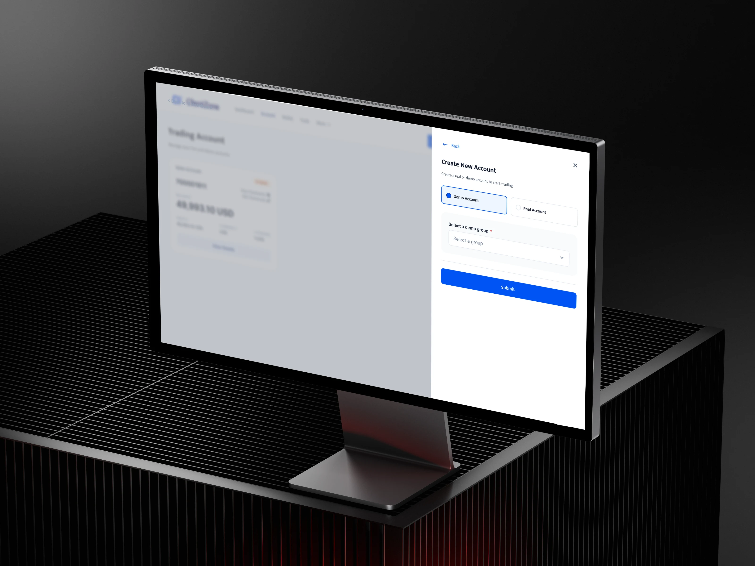
The drawer keeps the accounts page visible behind it. Account type comes first, then only the field that type needs.
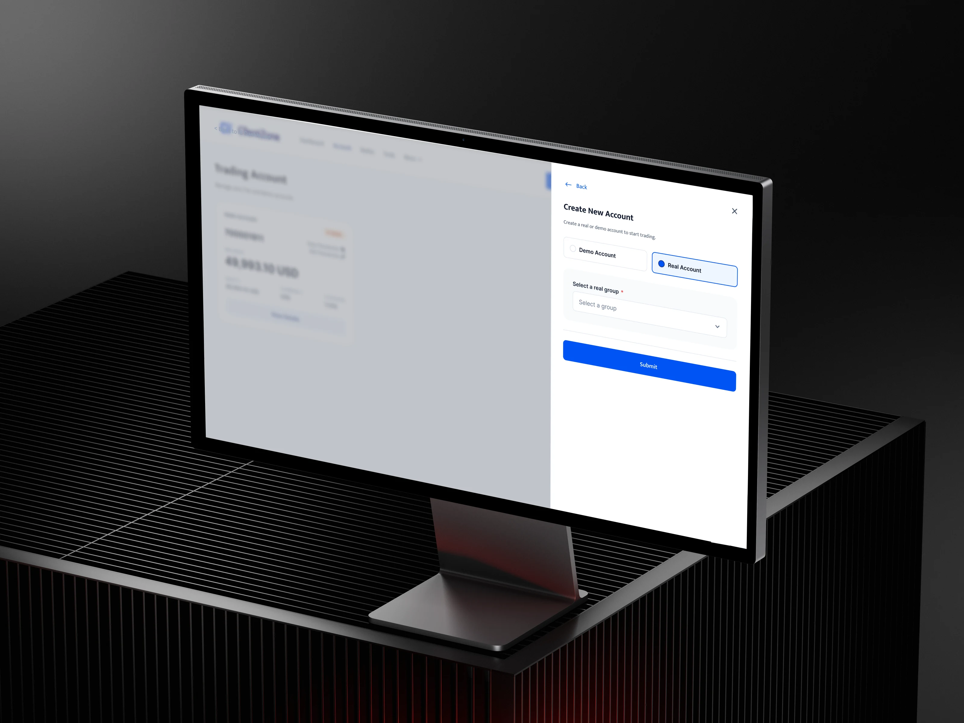
Switching to Real swaps the group list in place, with no new page.
wallet · trust in money flows
Deposits, withdrawals and history that work as one journey.
Wallet screens share one structure, so learning one teaches the rest. Each page starts by choosing an account, shows that account's figures, puts the main action in the same place, and ends with a history table.
Money moments get an explanation where people need it. The withdrawal page explains in plain words that the eligible amount is your free margin, and why it can be lower than net worth when positions are open. Person-to-person withdrawals carry a visible 2FA Required chip before the client starts, not as a surprise halfway through.
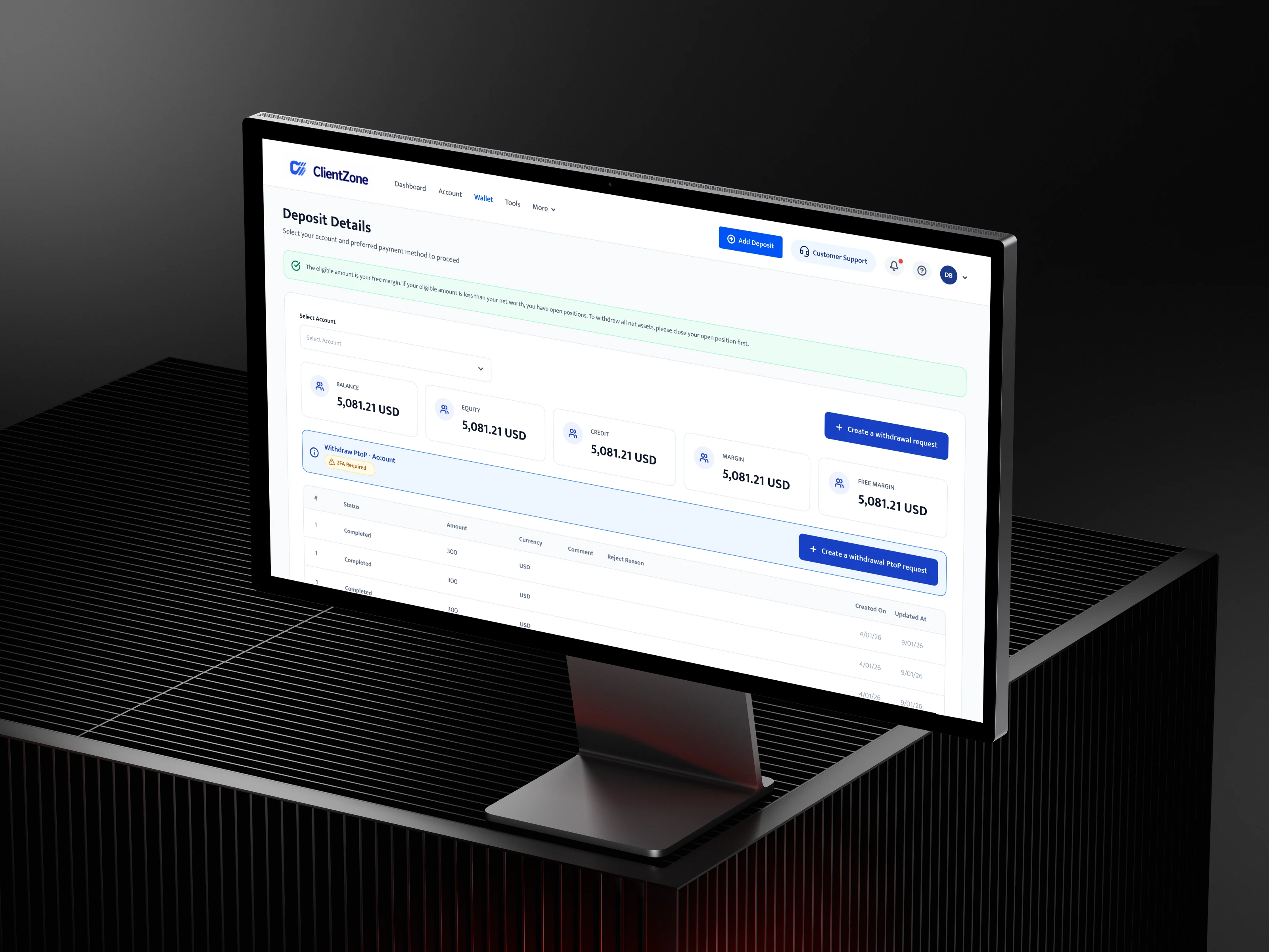
The rule is explained before the action. The client chooses the account first, there is one primary action, always top right, and extra security is flagged up front.
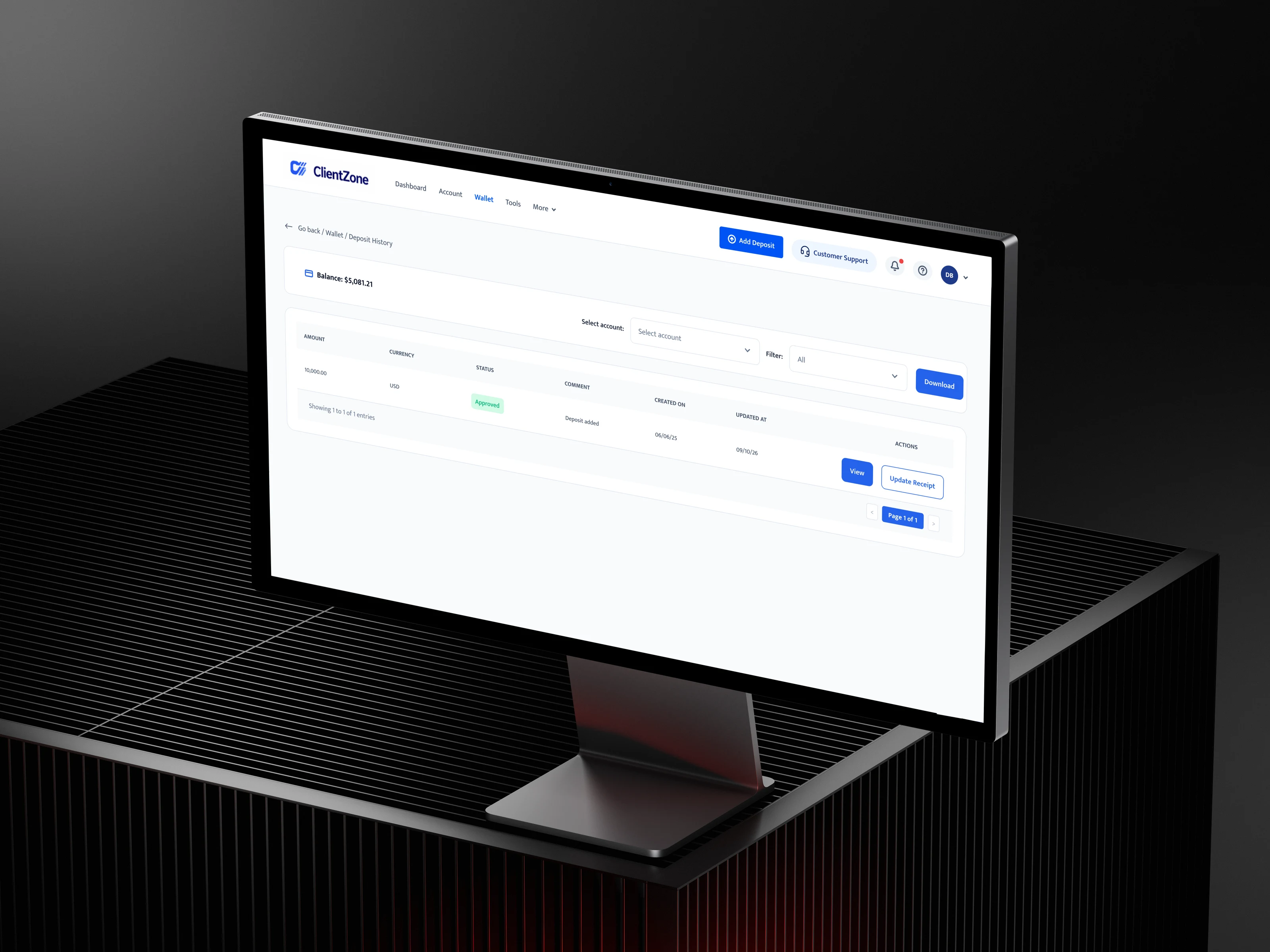
A breadcrumb leads back to the wallet. Clients filter by account and status, see a status chip instead of plain text, and get follow-up actions on each transaction.
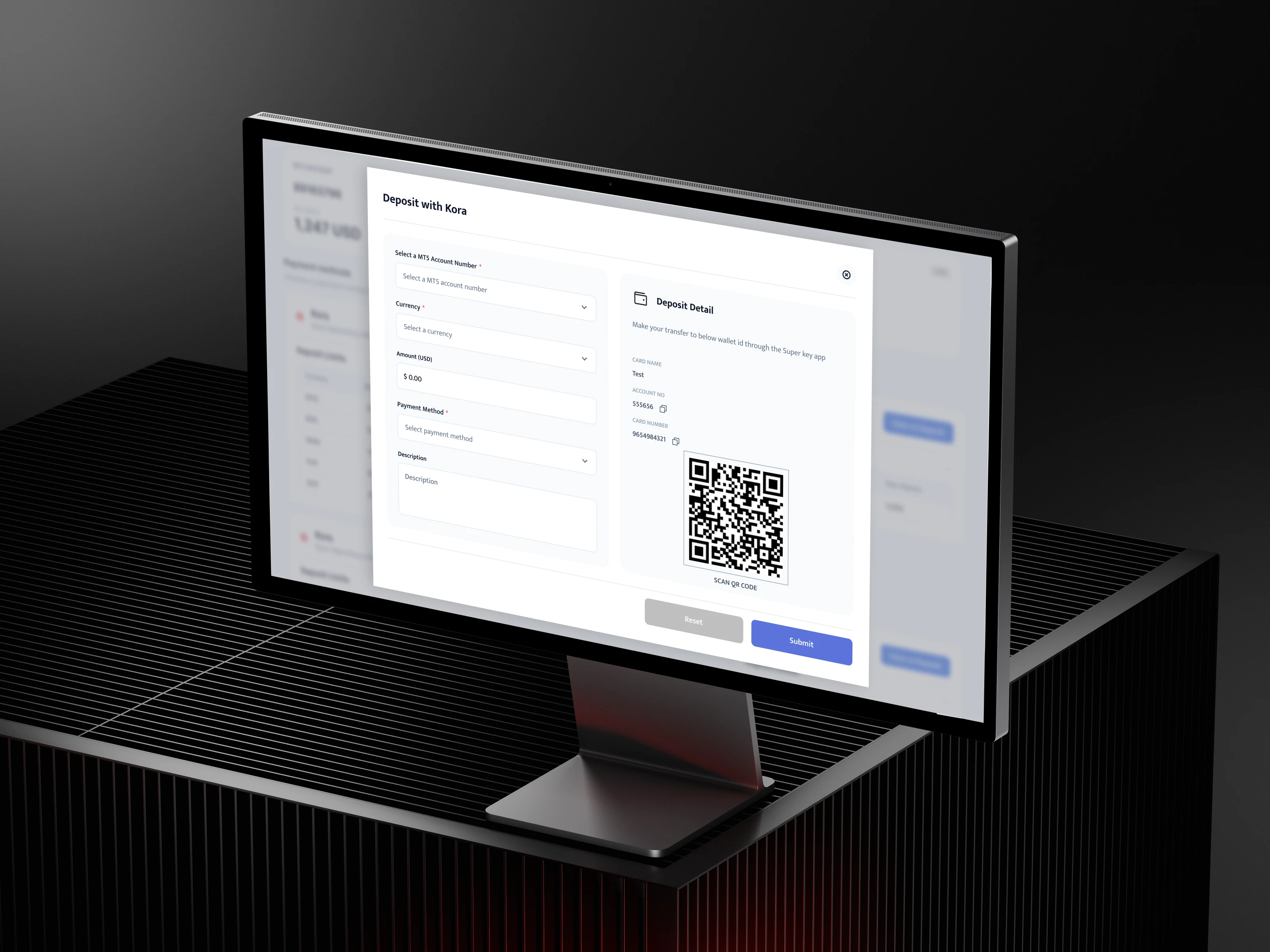
The deposit modal keeps the form and the payment details side by side, so the client sees where the money goes before they submit.
honest read
What I'd refine, and what I'd test
I'm not claiming outcome metrics for this redesign. The problems come from design reviews and proposals, not formal usability testing, and the original screens weren't archived, so the before state is shown as a structural diagram rather than a screenshot.
What I'd refine: distinct figure cards, because balance, equity, credit, margin and free margin deserve their own icons and emphasis, and free margin is the one that matters for withdrawals. One help entry, because the dashboard shows help twice and one persistent entry is enough. Clearer page naming across deposit and withdrawal views.
What I'd test: a five-second test on the dashboard to see what clients remember. Task tests: find a deposit, create a demo account, withdraw from a specific account. And a support ticket review before and after rollout.
Clients don't think in CRM modules. The portal now starts from their questions.
Informative Nudge
Next