03 / 04
Clients don't think in CRM modules
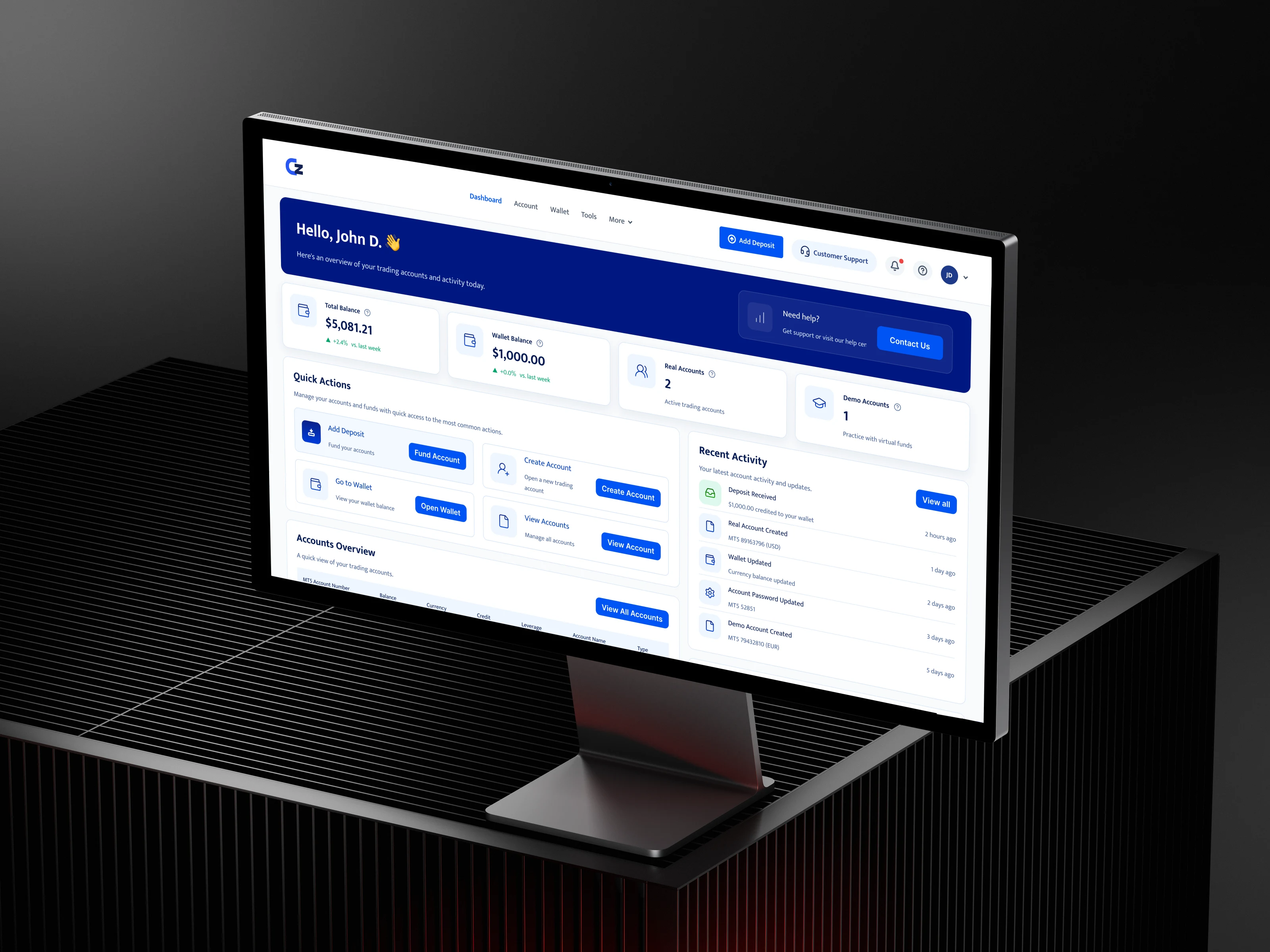
ClientZone is the client-facing portal of the Teamforce CRM platform, where brokerage clients manage trading accounts, deposits and withdrawals.
A client portal should reflect the client's world, not mirror the internal CRM's modules. I redesigned its structure, dashboard and money journeys around that principle.
the problem
The portal was shaped like the CRM behind it.
ClientZone had grown module by module, following the internal system's structure. For a client trying to answer “how much do I have, and what can I do with it?”, that structure got in the way.
The redesign starts from one rule: a client portal should reflect the client's world, not mirror the internal CRM's modules.
problems · three gaps
Three design problems the redesign set out to fix.
These come from design reviews and proposals during the redesign, not formal usability testing.
Structure
01
Fragmented information architecture
Account management, wallet activity, trading information and utilities lived in separate areas, with little connecting them.
Priority
02
Weak prioritisation
The homepage helped clients navigate to modules, but not understand their own account situation.
Hierarchy
03
Inconsistent interaction hierarchy
Primary actions, account details, financial figures and supporting tools looked too alike to tell apart quickly.
structure · before / after
From the CRM's modules to the client's questions.
The original screens weren't archived, so the before state is shown as a structural diagram rather than a screenshot.
Before · mirrors the CRM
Separate areas the client had to piece together themselves.
- Account management (internal module)
- Wallet activities (internal module)
- Trading information (internal module)
- Utility functions (internal module)
- No summary, no shared patterns
After · reflects the client
One summary first, then connected areas.
- Dashboard: my balances, my accounts, my next actions, my recent activity
- Accounts: real and demo
- Wallet: deposit, withdraw and history
- Tools: supporting
Design challenge
How might we turn a set of CRM modules into one portal that tells clients where they stand and what they can do next?
principle & scope
One principle, three areas.
The client portal should reflect the client's world, not mirror the internal CRM's modules.
Every layout decision was checked against it. Does this screen answer a client question (“how much do I have?”, “what happened to my deposit?”), or does it expose how the system is organised internally?
In scope
- Dashboard: a summary of balances, accounts, actions and activity
- Trading accounts: real and demo accounts, creation and account details
- Wallet: deposits, withdrawals, transfers, history and transaction details as one journey
- Shared patterns: header, page anatomy, tables, status chips
Out of scope · this phase
- Trading platform itself (MT5)
- KYC and onboarding flows
- Tools section content
- Brand theming per broker beyond logo and primary colour
ownership · mine vs ours
Which decisions I made, and which ones the team made.
Decisions I owned
“Client's world, not CRM modules”
The principle that reorganised the portal around client questions.
Decisions I owned
Dashboard as a summary
Balances, actions, accounts and activity, in that order.
Decisions I owned
Demo/Real as the first choice
Large options in a drawer, with a type-specific form.
Decisions I owned
One wallet page anatomy
The same structure for deposits, withdrawals and history.
Operations
Which account fields are mandatory
Number, balance, currency, credit, leverage, type.
Compliance
Free-margin and 2FA rules
The wording explains rules the business set.
Engineering
Template limits
What each brokerage can change.
trade-offs · what it cost
What each choice gave up.
Chose
Summary dashboard
Over: a dashboard of shortcuts to every module.
Cost: some modules are one click further away.
Chose
Drawer for account creation
Over: a separate page.
Cost: less room, which works only while the form stays short.
Chose
One wallet pattern
Over: a layout tailored to each transaction type.
Cost: some pages carry sections they barely need, in return for predictability.
Chose
Explain rules inline
Over: help articles.
Cost: more text on screen, but fewer “why can't I withdraw?” moments.
honest read
What I'd refine, and what I'd test
I'm not claiming outcome metrics for this redesign. The problems come from design reviews and proposals, not formal usability testing, and the original screens weren't archived, so the before state is shown as a structural diagram rather than a screenshot.
What I'd refine: distinct figure cards, because balance, equity, credit, margin and free margin deserve their own icons and emphasis, and free margin is the one that matters for withdrawals. One help entry, because the dashboard shows help twice and one persistent entry is enough. Clearer page naming across deposit and withdrawal views.
What I'd test: a five-second test on the dashboard to see what clients remember. Task tests: find a deposit, create a demo account, withdraw from a specific account. And a support ticket review before and after rollout.
Clients don't think in CRM modules. The portal now starts from their questions.
Informative Nudge
Next