02 / 04
An AI-native CRM that shows its uncertainty
Northstar is a working prototype of a goal-driven CRM for retention teams. I designed the journey from a stated goal to an audited action, then built it end to end as a React and TypeScript front end on synthetic data: 7 flows, 3 roles and 10 designed failure scenarios.
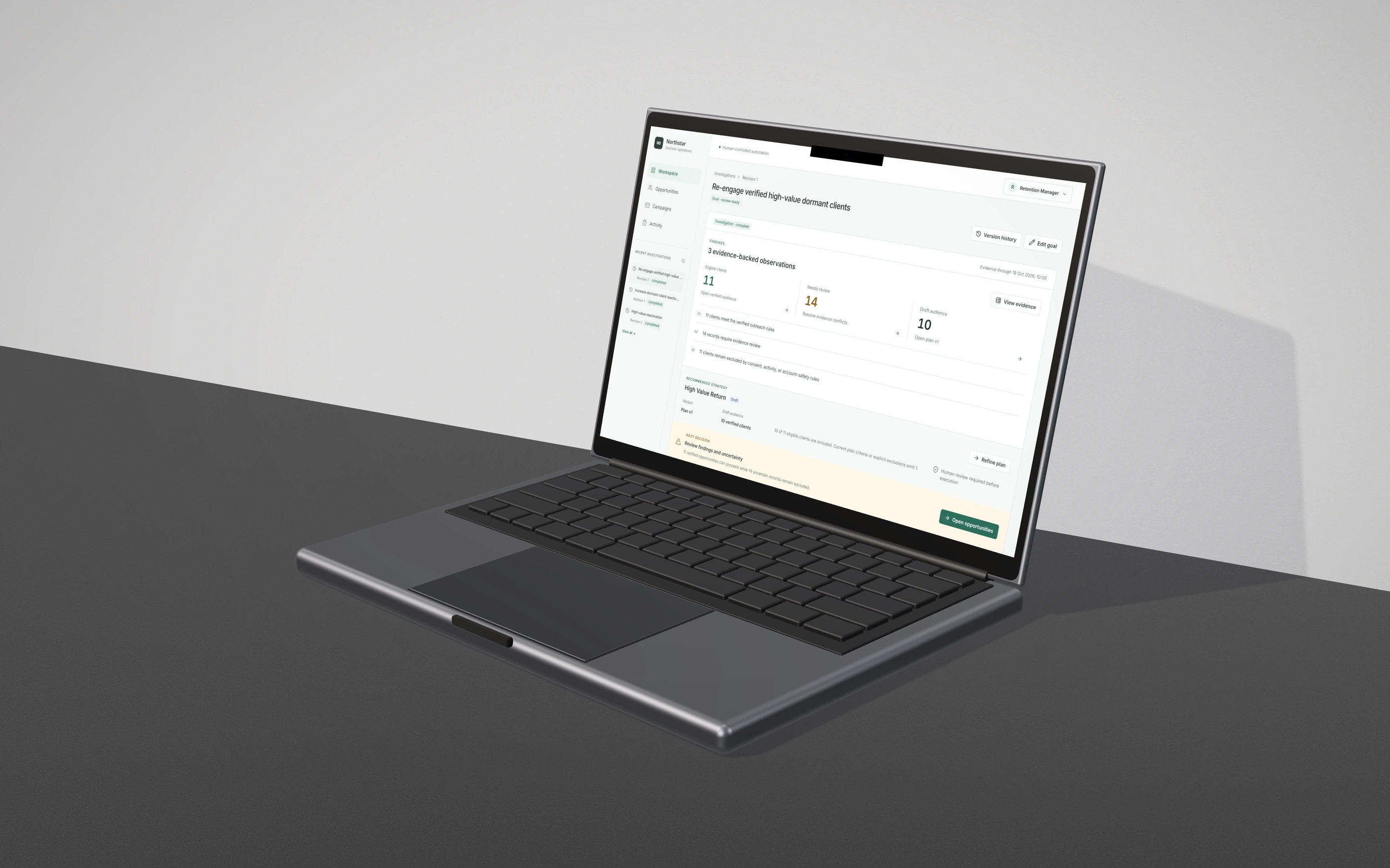
A CRM that stays honest about what its AI doesn't know
Retention teams reactivating dormant enterprise clients work in tools built around modules, not outcomes. The judgment that decides who gets contacted lives outside the system, in exports and spreadsheets, where nobody can audit it.
Northstar starts from a business outcome. The AI investigates and drafts, people keep authority over consequential decisions, and the handoffs between them are designed rather than left to chance.
the experience
From a goal to an audited action, in one connected thread
The journey runs Goal, Investigation, Evidence, Opportunities, Refinement, Approval, Execution and Recovery. Every screen belongs to one investigation, so a finding, the plan it led to and the approval it needed never lose their connection.
Designed
- 10 Figma screens across 7 flows
- States the screens didn't cover: running investigation, impact review, approval outcomes, execution recovery
- Role and autonomy boundaries
Implemented
- A working prototype of every flow
- Plan versioning and approval of an exact version
- Role-based actions, audit log, simulated execution with safe retries
Validated
- An end-to-end Fresh Start journey on synthetic data
- 13 unit and component tests and a 10-step journey test
- WCAG 2.1 AA scan, zero violations across 9 screens
Still a prototype
- Synthetic clients and simulated sends
- Grounded in competitive research on AI-native CRMs, not yet tested with retention or compliance teams. No business metrics yet.
- Never connected to a live CRM or email provider
goal · workspace
The home screen asks for an outcome, then shows the next decision
First-time users see a goal composer, three suggested goals and a short explanation of what happens next. There are no empty charts. Returning users see Needs attention and Continue work, ordered by the next useful decision rather than the last page they opened.
The list depends on the role. A retention manager sees “Waiting for approval of plan v1”. A compliance reviewer sees the same item as “Authorize plan v1”.
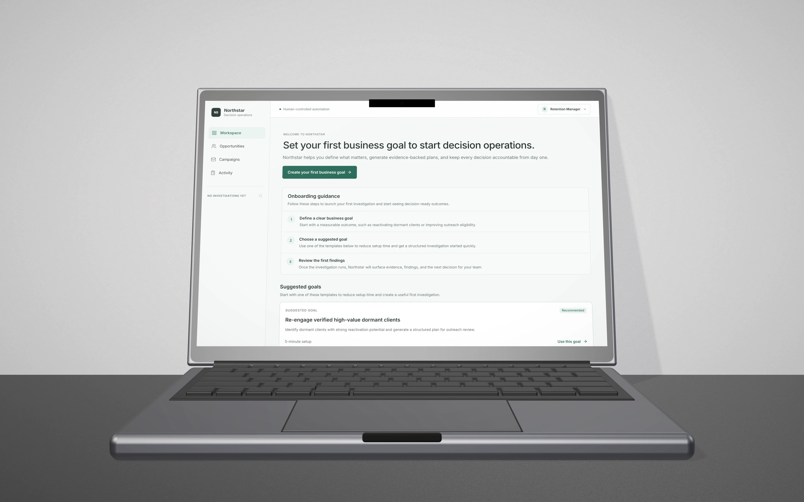
First run: one primary action, and suggested goals that fill in the composer and stay editable before anything runs.
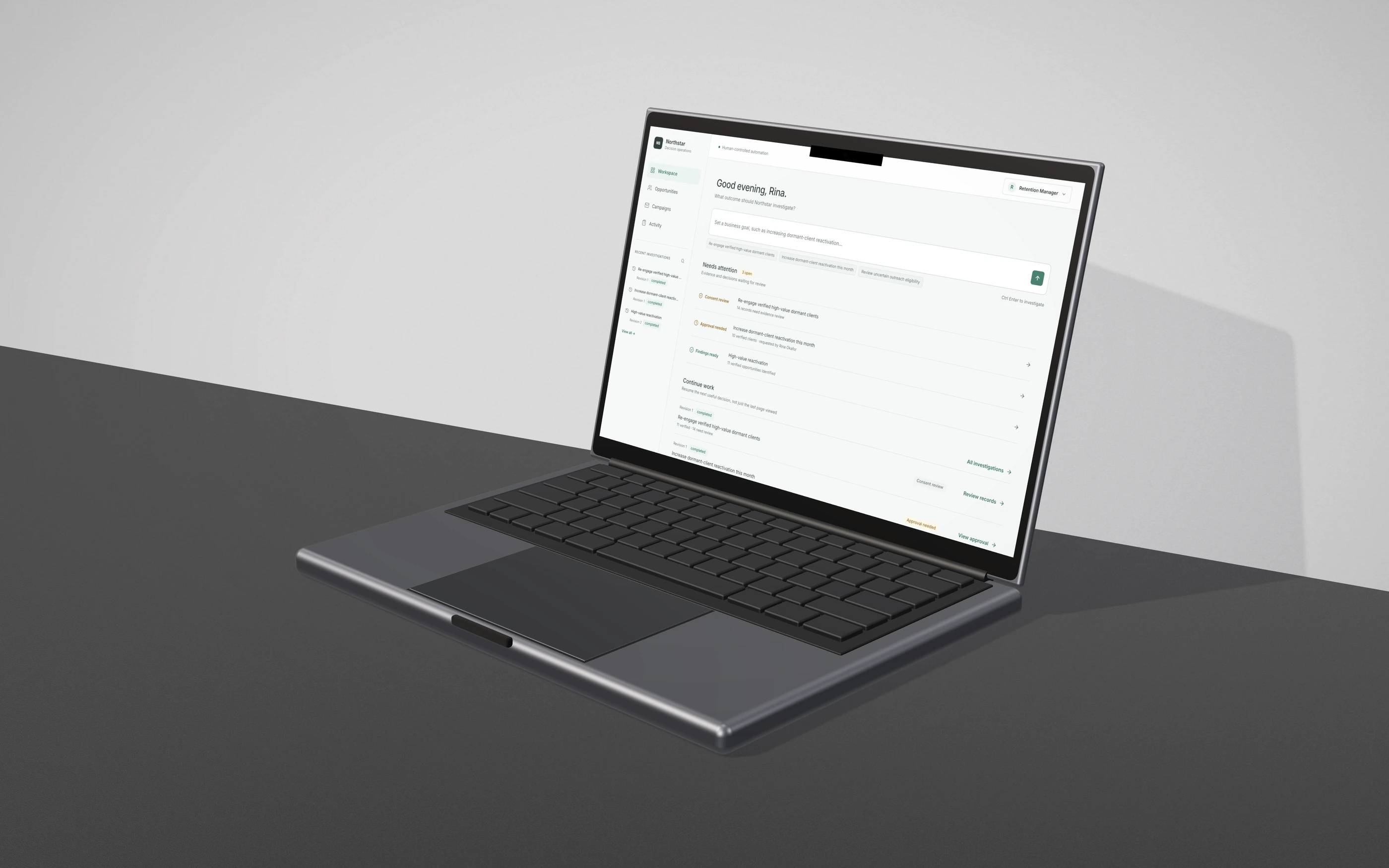
Returning: a new goal is always one line away, pending decisions come first and are tagged by type, and Continue work links to the next decision, not the last screen.
investigation · seam 1
The AI shows its work while it runs, and reports findings, not verdicts
An investigation shows what it is checking as it goes: interpreting the goal, gathering evidence, verifying consent and KYC, classifying, drafting a plan. The progress screen states the boundary plainly: investigations only read evidence.
When it finishes, the badge reads Investigation complete while the goal reads review ready. They are separate states on purpose. Finishing the analysis doesn't mean the business goal is met, and the interface never suggests otherwise.
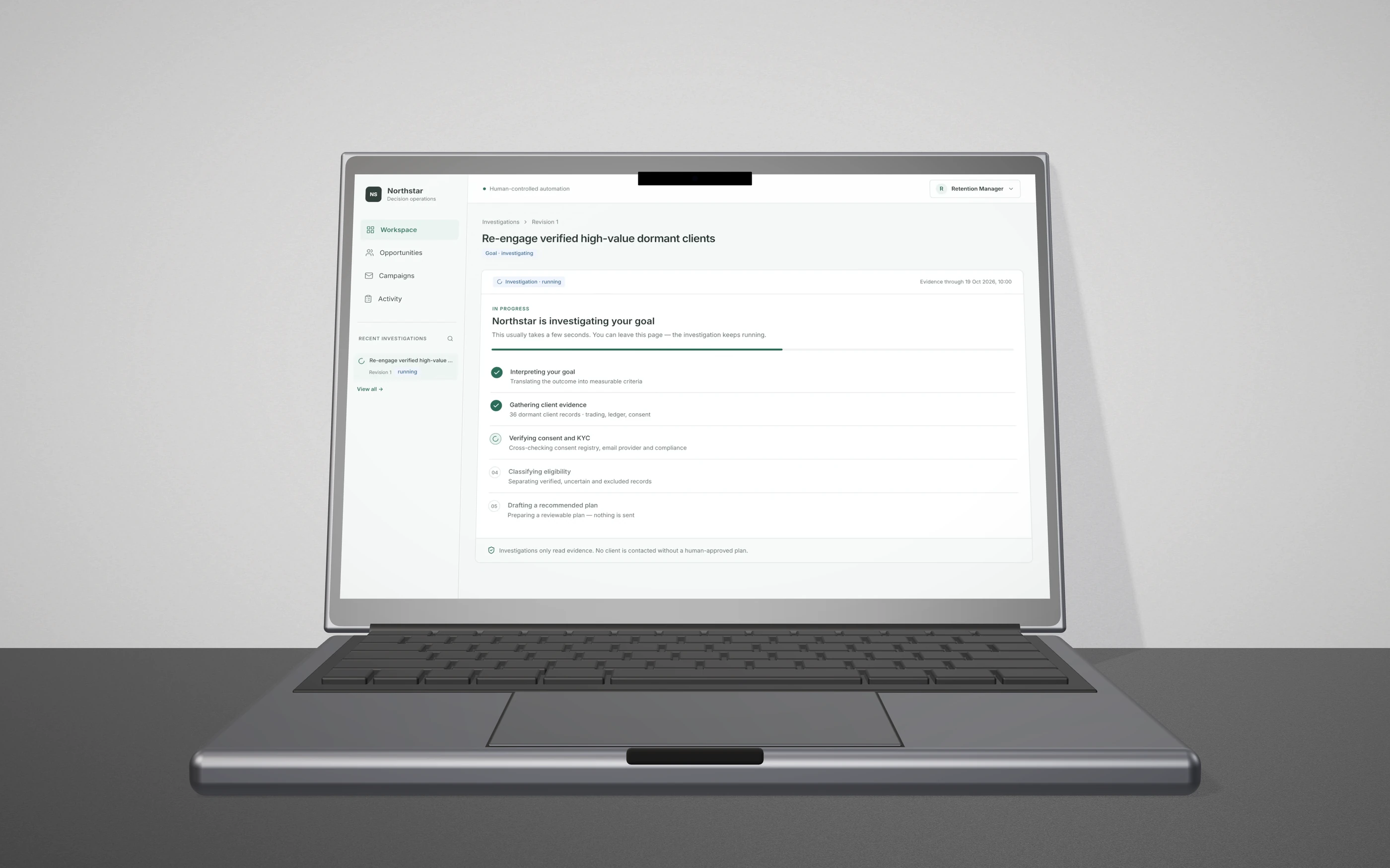
Progress is calculated from the start time, so it survives a page reload. The read-only boundary is stated where the user is waiting, which is when they wonder what the system is doing.
opportunities · seam 2
“Needs review” and “omitted by criteria” look alike. They are different problems
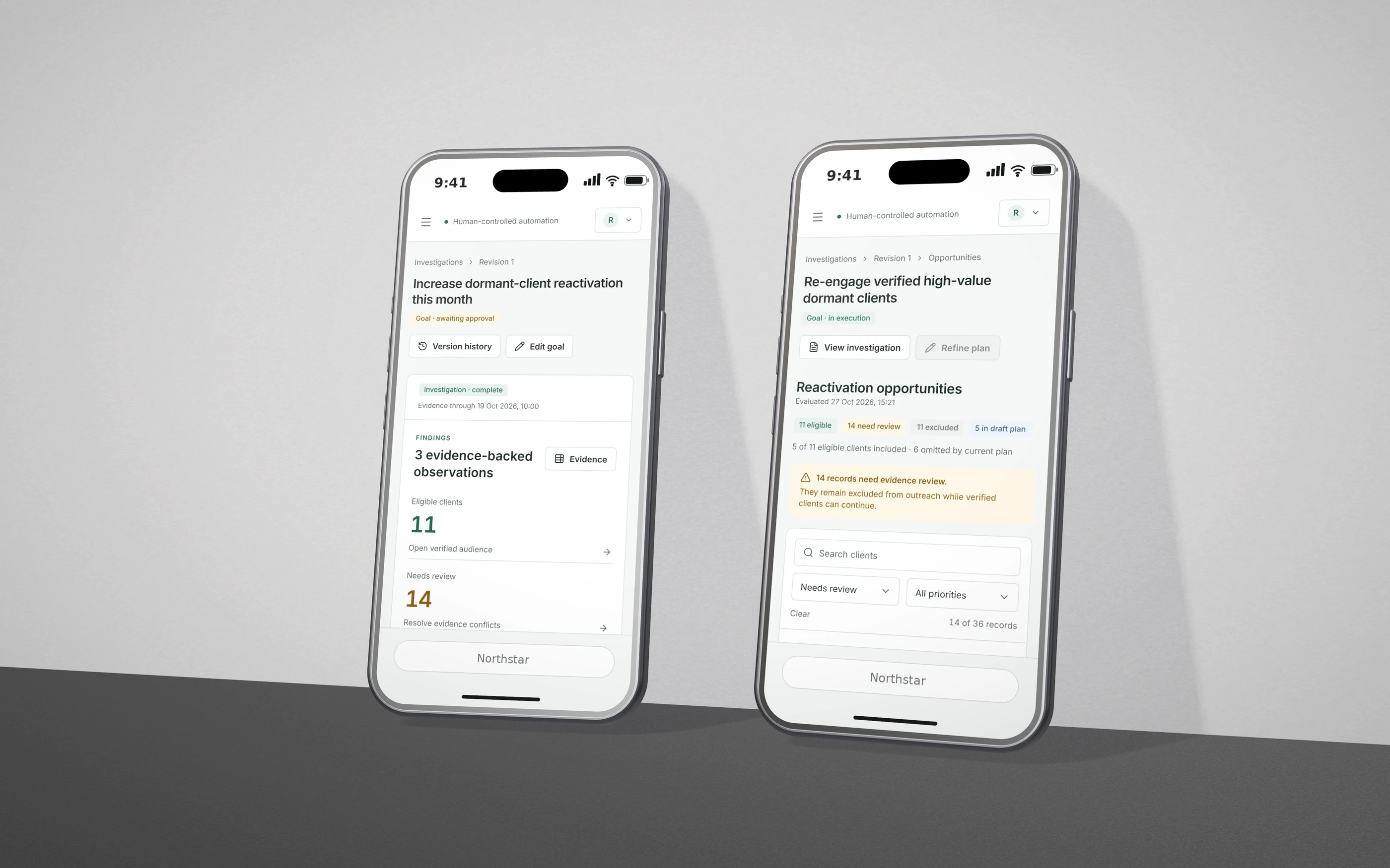
A client can be left out of outreach for two very different reasons. Held for review means the evidence conflicts, so a person must resolve it. Omitted by criteria means the client qualifies but the current plan rules leave them out, so the fix is a plan change. Each state has its own label, colour and next action.
Inside a client record, each piece of evidence names its source and observation time, and is marked either Verified fact or Conflict. The AI never picks a side between conflicting records. It shows both.
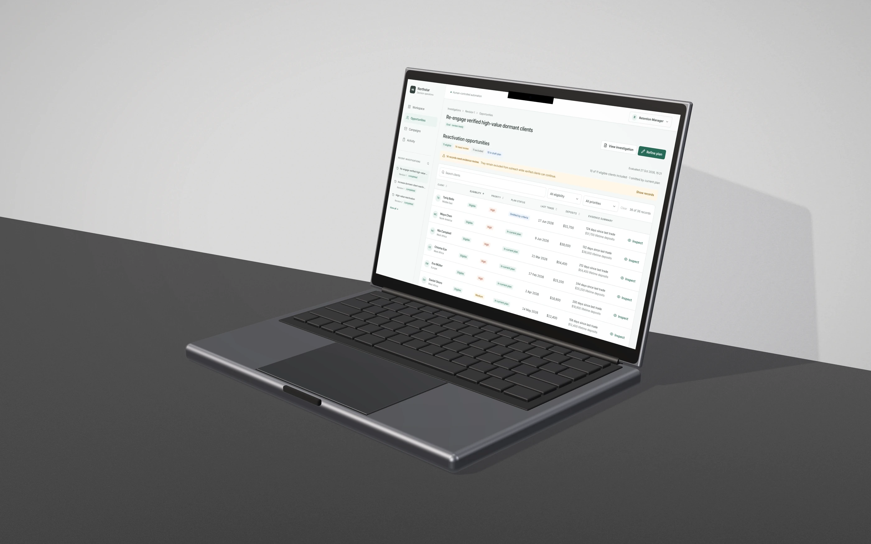
The uncertain group is announced before the table, together with what is still safe: verified clients can continue. Plan status is its own column, separate from eligibility.
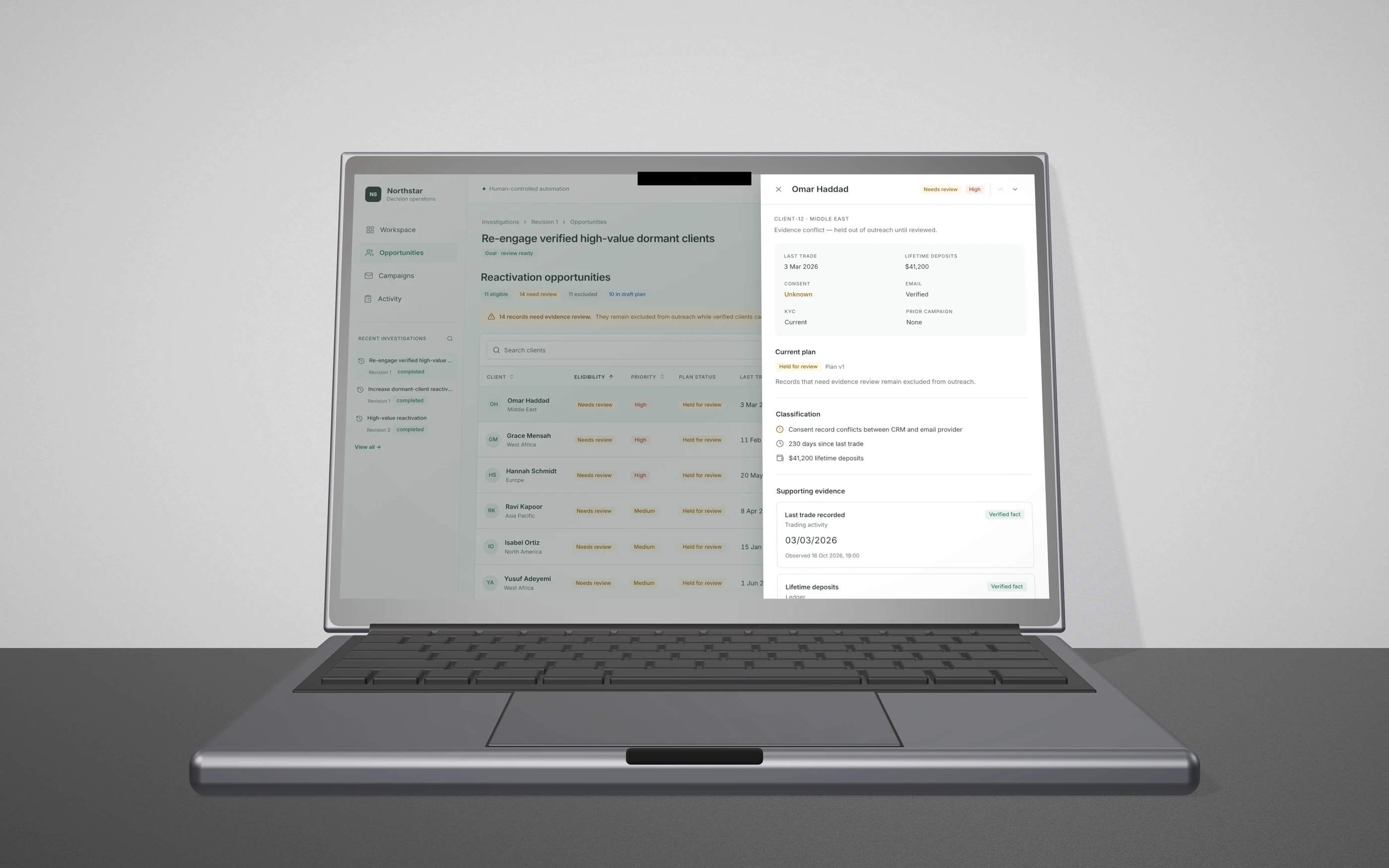
Conflict: the headline says why this client is held, and the uncertain field is flagged inside the facts, not hidden in a tooltip.
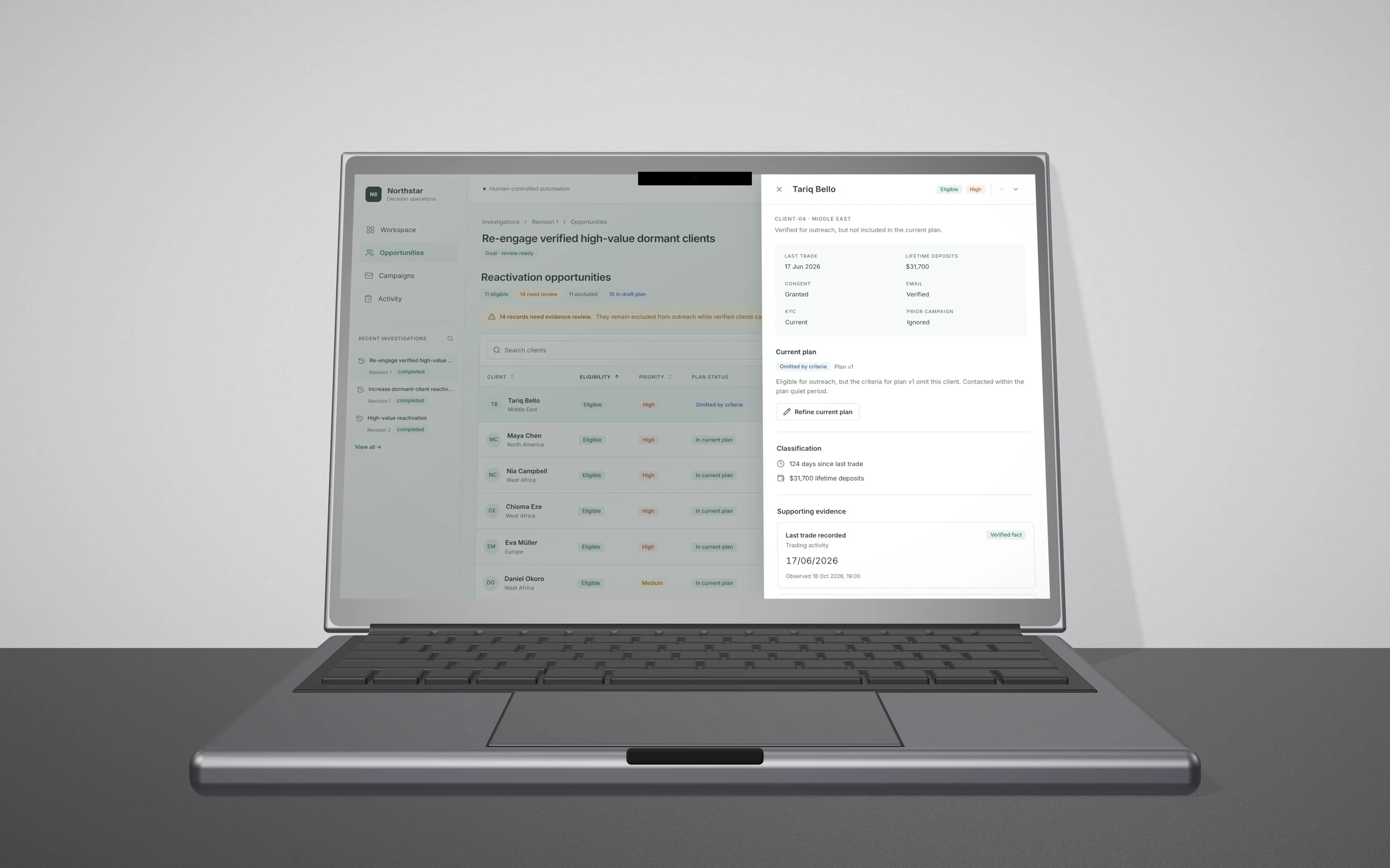
Omitted: the status comes with its own fix, refine the plan or exclude the client explicitly in the next version. Facts carry their source and the time they were observed.
refinement · seam 3
You can't save a plan change until you've seen who it affects
Refining a plan always creates a new version. Plan v1 stays untouched. Save as new version stays locked until the user runs Review impact, which lists the audience before and after, by name, with the rule that removed each person.
If the user edits anything after reviewing, the impact review is marked out of date and saving locks again. This is the same rule that governs approvals, applied one step earlier: a decision only counts for the exact inputs it was made on.
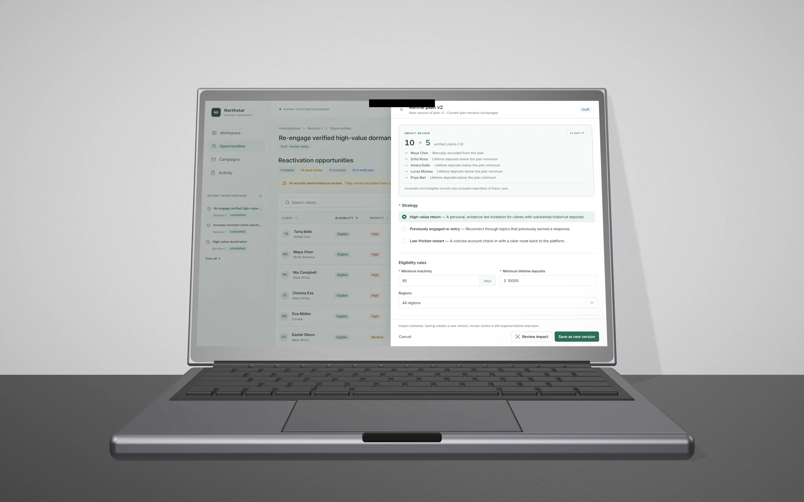
Reviewed: 10 to 5 clients, each removal explained, and saving unlocks only now.
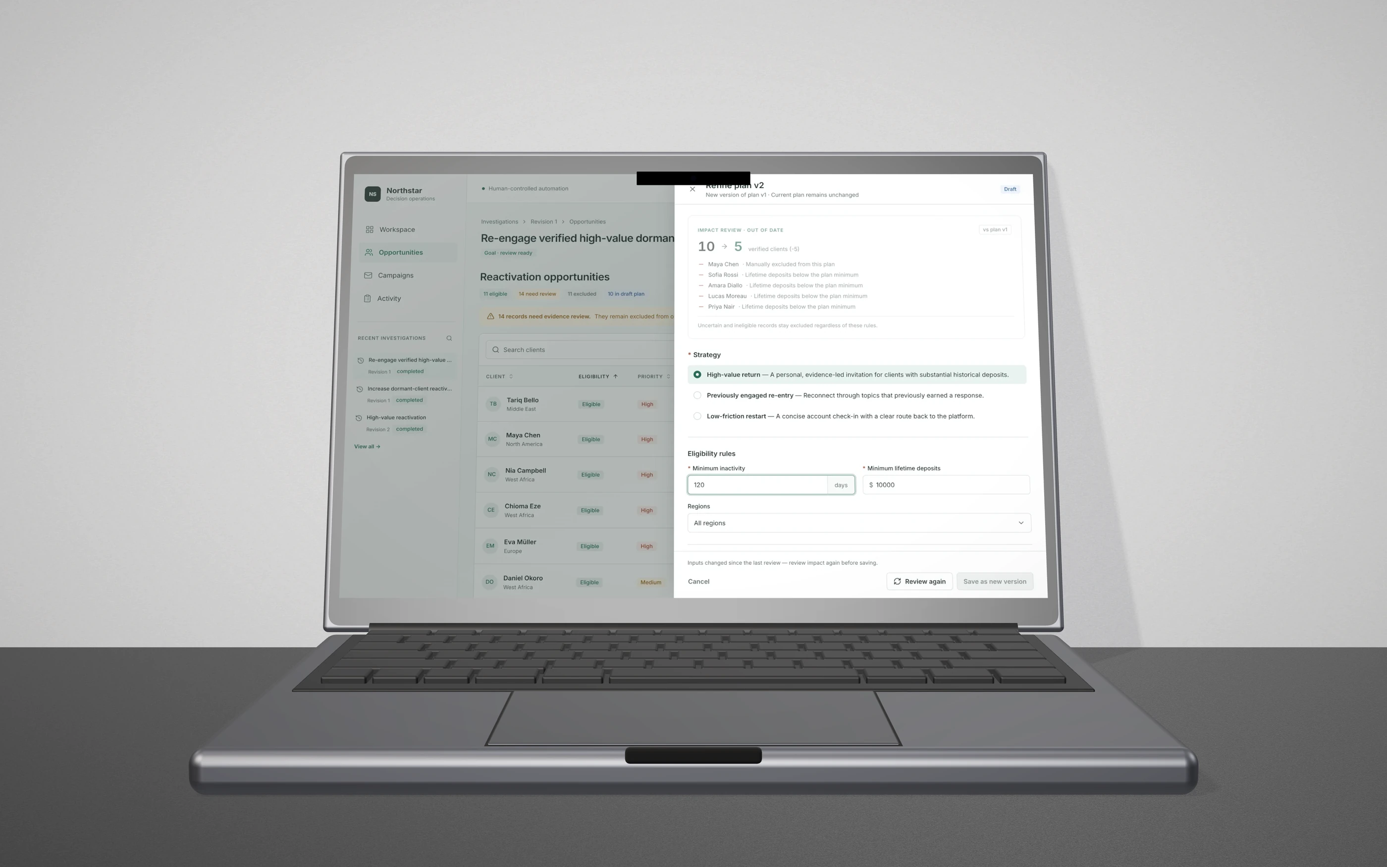
Stale: the old review fades and is labelled out of date, and the footer explains why saving locked and how to unlock it.
approval · seam 3
Requesting approval doesn't send anything. Approval covers one version
The campaign screen splits into the plan and an authorization rail. The rail names the executable candidate: plan version, audience size, channel. It says outright that requesting approval does not execute outreach, because people hesitate before buttons that might have side effects.
The compliance reviewer sees the same plan with different controls: approve this version, or request changes with a required note. The approval states that version number in writing.
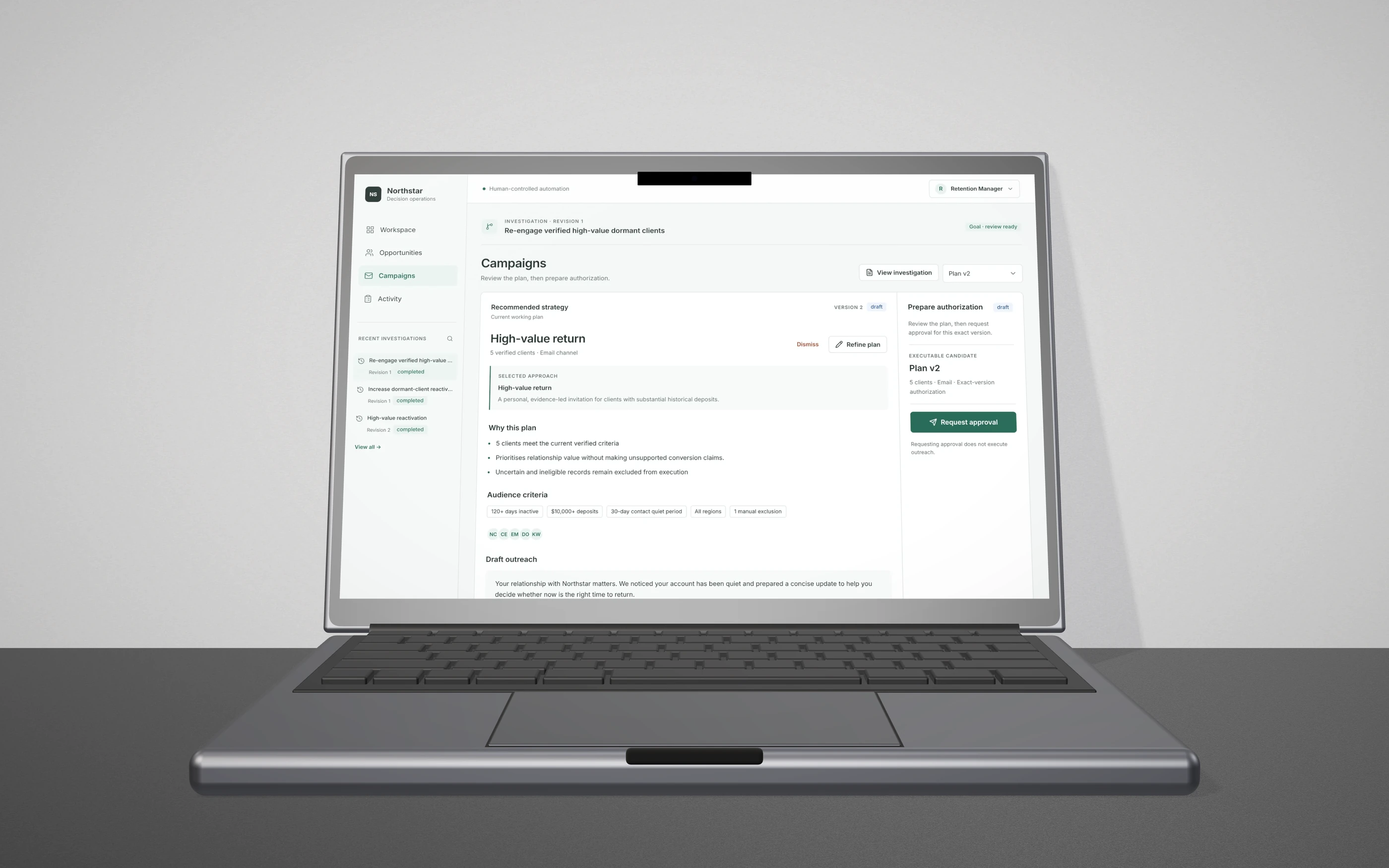
Manager view: the exact thing being authorized, and the side effects of the button, stated up front.
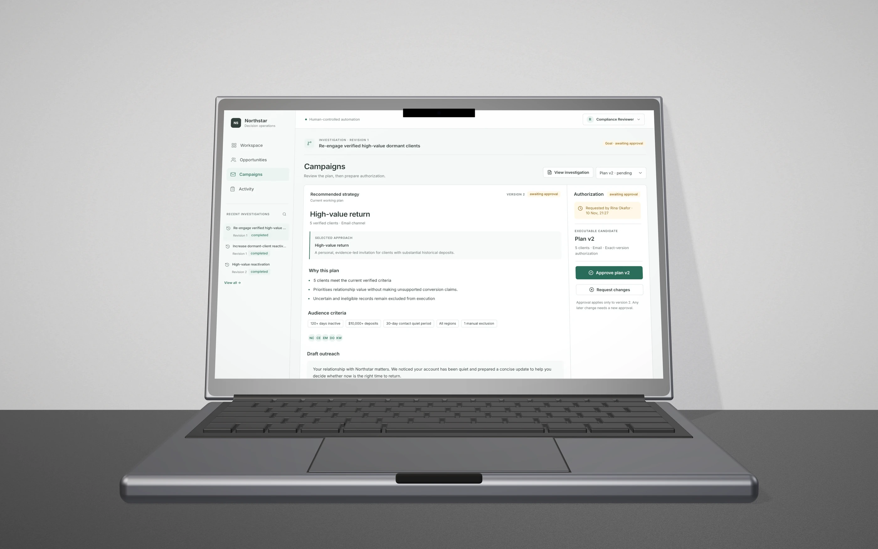
Compliance Reviewer view: the version is in the button label, and any later change needs a new approval.
execution · seam 4
Every consequential step leaves a record a person can read and a system can verify
Execution asks for one last confirmation with the real number of recipients. The Activity log then separates AI and system, human decisions and execution. Each event has a plain-language summary, the key numbers and the technical record underneath, so a compliance reviewer and an engineer can read the same event.
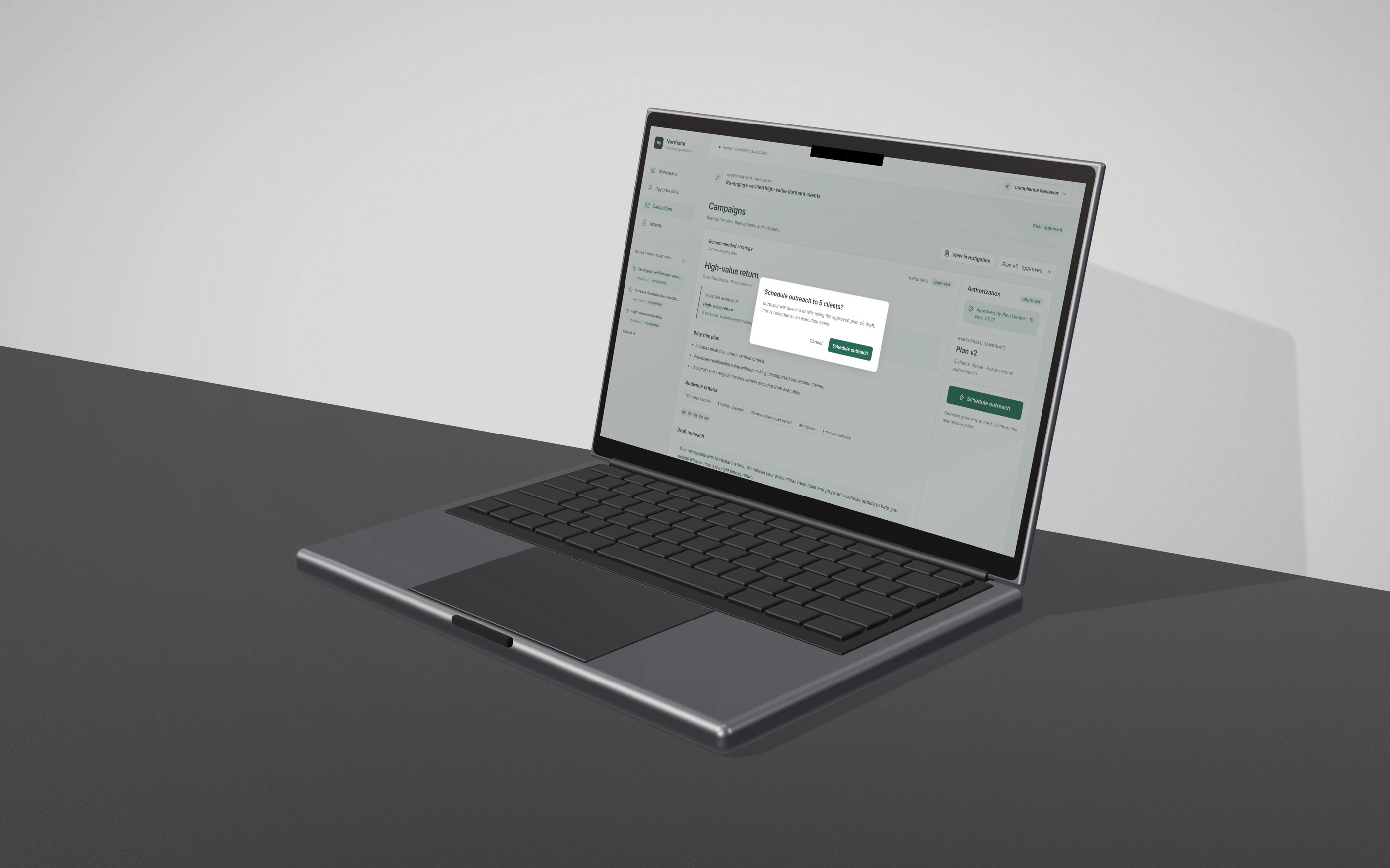
The confirmation states the count, the version and that the step is recorded. It does not say “Are you sure?”.
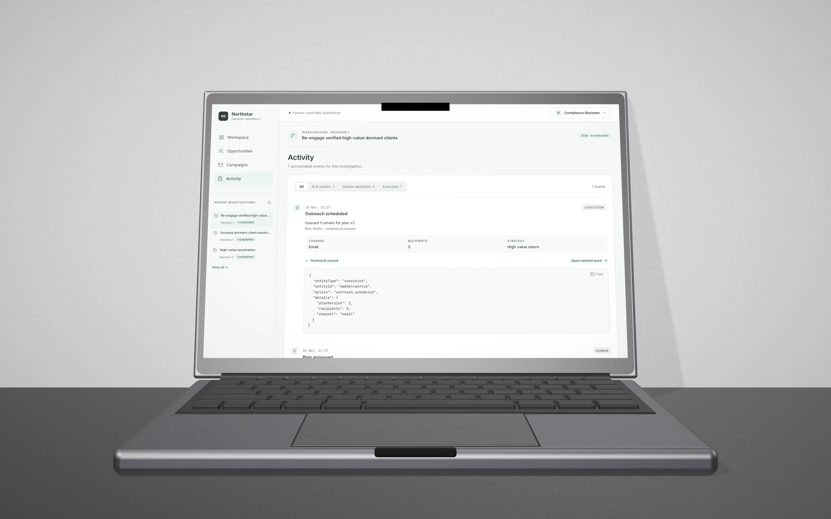
Filters by who acted, events that state the outcome in plain language, and the structured record behind a disclosure with a copy button.
On phones
The Figma file was desktop only. On phones, tables become cards, side drawers go full screen, and the uncertainty banner stays above the list.
limits & next
What this is, and what it isn't yet
Still a prototype. The data is 36 invented clients built to exercise eligible, uncertain and excluded paths, and execution is simulated: no real email was sent and no live CRM or provider was connected. The design reasoning comes from the problem framing, not from studies with retention or compliance teams, and nothing here measures reactivation, conversion or time saved.
Next: test the journey with real retention managers and compliance reviewers and watch where they hesitate at each seam. Measure time to a trusted decision, not clicks saved. Learn which conflicts teams resolve fastest and which they escalate. Then connect a real data source behind the same boundary, keeping execution simulated until approvals hold under load.
The AI does the investigating. People keep the authority. The space between them is designed, not left to chance.
Informative Nudge
Next